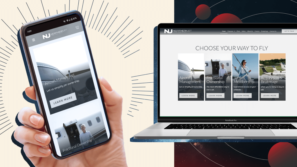
Making sure your website looks great and works well is important. A well-crafted website design not only attracts visitors but also keeps them engaged. To make your website stand out, you need to pay attention to details like color scheme, navigation, mobile optimization, and using high-quality images.
Choosing the Right Color Scheme
The colors we choose for our website can make a big difference. They help set the mood and make the site look attractive. Picking the right colors can make our brand stand out. Here are some tips for choosing the perfect color scheme:
- Understand Color Psychology: Different colors can make people feel different things. For example, blue can make people feel calm and trustworthy. Red can make people feel excited. Think about what feelings we want our website to inspire.
- Match Our Brand: Our color scheme should match our brand’s personality. If our brand is fun and playful, bright and bold colors might work well. If our brand is more serious, softer and more muted colors might be better.
- Use a Color Tool: Tools like Adobe Color can help us choose colors that look good together. These tools can create color palettes based on our main color. They make sure that all our colors work well together.
- Consider Accessibility: Make sure that everyone can see and read our website easily. Choose colors with enough contrast for text to be readable. Avoid color combinations that are hard to see for people with color blindness.
By carefully choosing our color scheme, we create a website that is visually appealing and true to our brand.
Keeping Navigation Simple
Simple navigation makes it easy for visitors to find what they need. If our website is confusing, people might leave before finding what they are looking for. Here are some ways to keep our navigation clear and simple:
- Use Descriptive Labels: Make sure our menu labels are clear and descriptive. Instead of using fancy words or jargon, use plain language. People should know what they will find when they click a link.
- Limit Menu Items: Too many choices can overwhelm visitors. Stick to a few main categories in our menu. Group similar pages together. Use drop-down menus if needed, but keep them organized.
- Create a Logical Layout: Arrange our navigation in a way that makes sense. Put the most important links first. Use a structure that guides visitors to the next step easily.
- Include a Search Bar: Sometimes people know exactly what they are looking for. A search bar helps them find it quickly. Place the search bar in a prominent spot, like the top of the page.
- Test with Real Users: Ask friends or family to navigate our site. Watch where they get confused or stuck. Use their feedback to make improvements.
Simple navigation helps visitors have a good experience on our site. When they can find what they need easily, they are more likely to stay longer and come back.
Optimizing for Mobile Users
A lot of people visit websites on their phones or tablets. Our website needs to look good and work well on all devices. This will keep visitors happy and engaged. Here are some tips for optimizing our website for mobile users:
- Responsive Design: Use a responsive design that automatically adjusts to fit any screen size. This makes sure our site looks great on desktops, tablets, and phones.
- Fast Loading Times: Mobile users often have slower internet connections. Optimize images and other media so they load quickly. A fast website keeps visitors from getting frustrated and leaving.
- Easy Navigation: Make sure buttons and links are large enough for people to tap easily with their fingers. Simplify the menu so it’s easy to use on a small screen.
- Readable Text: Use a font size that is easy to read on smaller screens. Avoid making people pinch and zoom to read our content. Keep paragraphs short and to the point.
- Test on Multiple Devices: Test our website on different devices to make sure it works well on all of them. Check for any issues with layout or functionality. Fix any problems we find.
By focusing on mobile optimization, we provide a better experience for visitors using their phones or tablets. This can lead to more time spent on our site and higher engagement.
Using High-Quality Images and Graphics
High-quality images and graphics make our website look professional and appealing. They help tell our story and draw people in. Here are steps to ensure we use the best visuals:
- Use Relevant Images: Choose images that match our content and brand. They should help convey our message and enhance the overall look and feel of our site.
- Optimize Image Size: High-quality doesn’t mean large file sizes. Compress images to reduce loading times without losing quality. Use tools like TinyPNG or Photoshop for optimization.
- Consistent Style: Stick to a consistent style for all images and graphics. This creates a cohesive look across our website. Whether we use illustrations, photos, or icons, they should all go together well.
- Alt Text for Accessibility: Add descriptive alt text to all images. This helps people who use screen readers understand what the images are. It also improves SEO.
- Avoid Stock Photos: While stock photos can be useful, try not to rely on them too much. Custom photos and illustrations are more unique and can make our brand stand out.
By using high-quality images and graphics, we create a more engaging and visually appealing website. Good visuals help attract visitors and keep them interested.
Final Thoughts
Improving our website design involves several key elements. Choosing the right color scheme sets the tone and enhances our brand identity. Keeping navigation simple ensures that visitors can easily find what they need. Optimizing for mobile users makes sure our site looks and works well on any device. Using high-quality images and graphics makes our site visually appealing and professional.
Focusing on these areas improves the user experience and can lead to more engagement, better SEO, and higher satisfaction among our visitors. It’s about making our website not just look good but also function well for everyone who visits.
Ready to take your website design to the next level in 2024? Contact Rocket Chimp today, and let our expert web designers in Orlando create a stunning, user-friendly website that stands out!


